Case study
HempLab Ink
From the ThinkMatra archive. Originally published 2017-09-09.


Birth of a Canadian Brand
A hemp fiber-based lifestyle brand bringing on the green revolution with style. A bold graphic logo defined the brand personality. The variant, designed as an emblem aligned it stronger to the cause.
Identity Design
Ideation
Brand Archetype
Rebel – Magician – Explorer – Hero
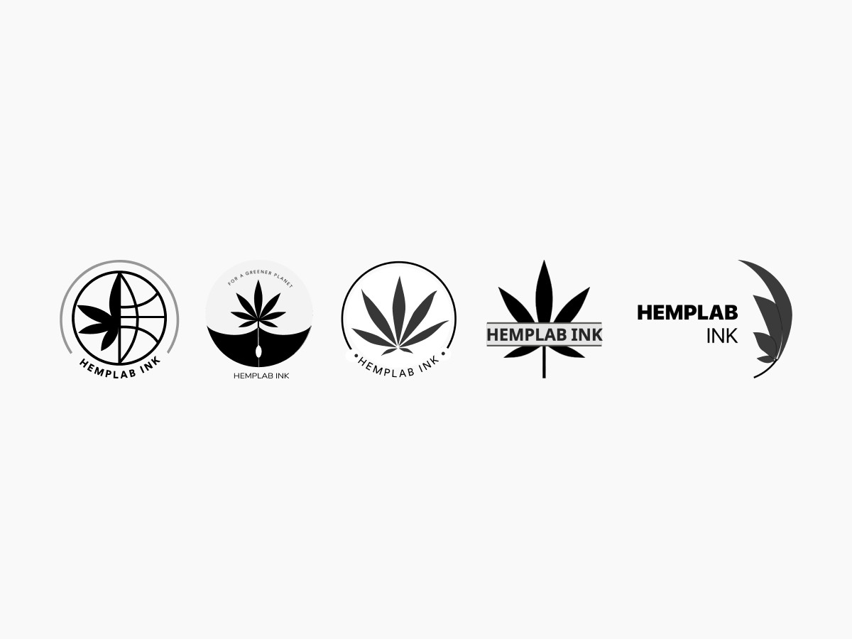
From a design perspective, our logo is bold, classic, and makes a graphic statement. The signature mark is a quick communicator of what the brand stands for.
Branding
Primary Logo
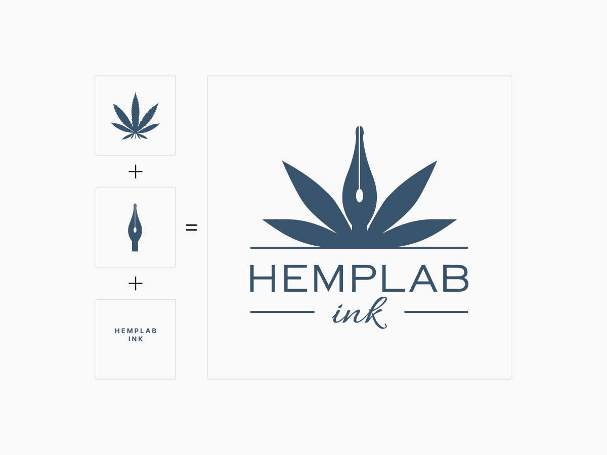
From a design perspective, our logo is bold, classic, and makes a graphic statement. The signature mark is a quick communicator of what the brand stands for, the aspiration, energy, and optimism of redefining the world with sustainable alternatives. A simple and direct mark,
Hemplab Ink is for everyone.
Branding
Logo Emblem
As we look to work with the community and leverage its energies to push the Eco message forward and include more a more people in the wave, it is suited to have an emblem-style version of our logo to be used as a stamp
of identity and support.

Branding
Logo Usage
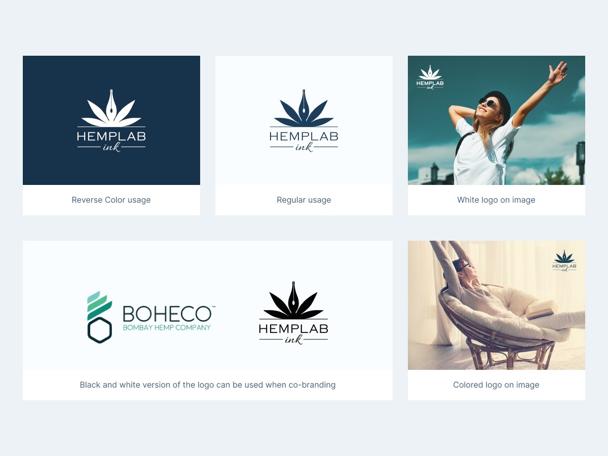
We strongly prefer the use of the full-color logo on a white background. The white color logo is to be used only as a last resort in images with a dark background. We must ensure there is adequate contrast when used with photography.
Branding
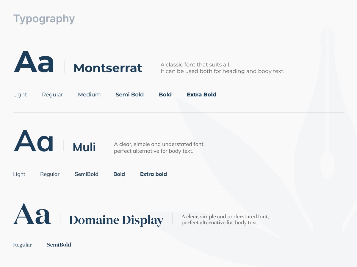
Logo Colors and Typography
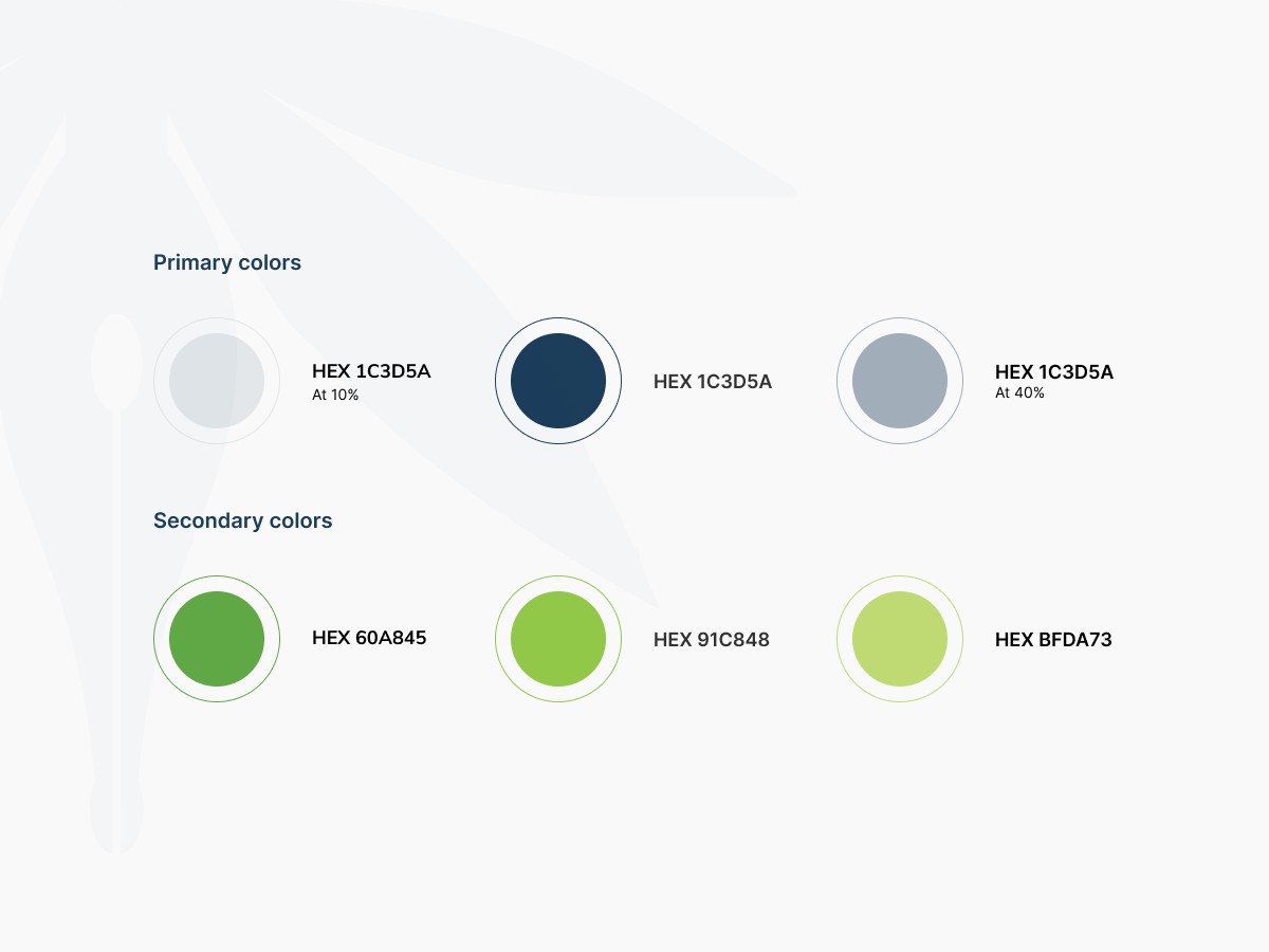
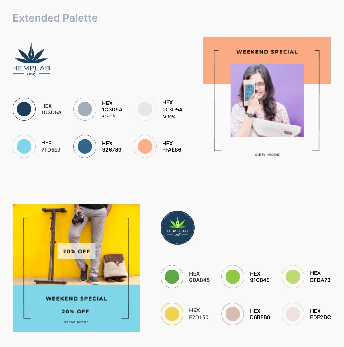
Color is an important element of brand identity. Color helps your audience identify who you are at a glance. The morphed oxford blue color relates to trust and dependability, it helps with customer loyalty. The blue family also stands for innovation and corporate business because it is “productive and non-intrusive”. While the green tones reflect the brand’s environmental sensitivity. Green is also the color of growth, the color of spring, renewal, and rebirth. It renews and restores depleted energy and also overall increases the level of happiness.
Matra has done an excellent job with our branding elements after thorough research and creative process that not only clarified our brand for the customers but also helped our startup get more clarity in positioning. I would trust them in a heartbeat to work on all our future branding endeavors.
Mihir
Founder and CEO, Hemplab Ink